Quick Photo Adjustment
I process a lot of pictures for web and email. Perfection is rarely my goal, but good results are. This is an explaination of how to quickly make the most of your images when your plan is to quickly and easily share with others via web.
Contents
Taking the Best Picture You Can
Whenever possible, take the best quality picture that you can.
- Use the highest resolution the camera is capable of taking for every shot. Memory is cheap.
- Set the camera up for the shot. If you lack the knowlage for this, just leave it on AUTO.
- Lighting is key. Plan your position and use a flash.
- Hold the camera as still as you can.
- Frame the shot as best as you can. It that is not possible, leave some room on the sides for cropping later.
Taking pictures is a subject unto itself. I just could not continue without briefly mentioning the very basics.
The Original Image
99.9% of original images need cropping. This is the first step when working with an image.
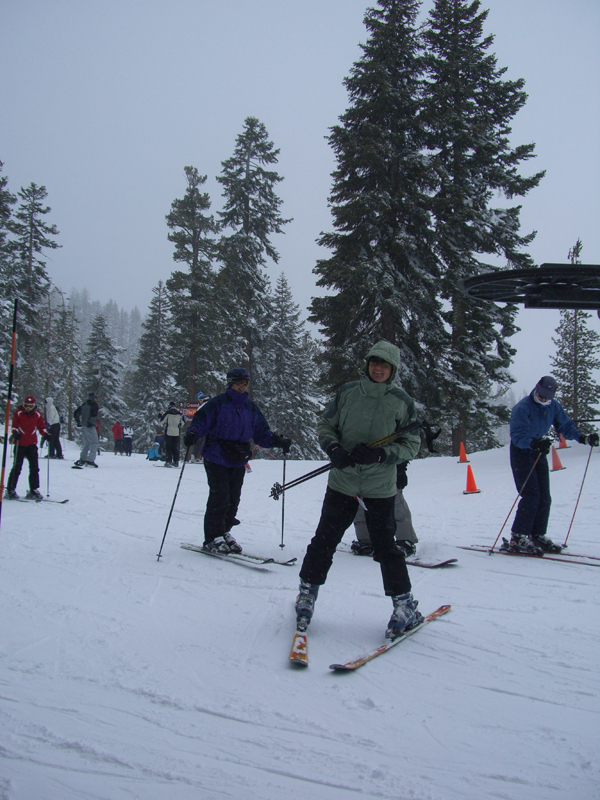
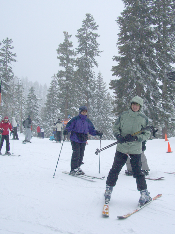
Here is a sample that we will play with (My wonderful wife at Northstar):
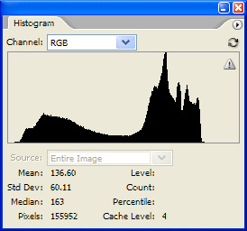
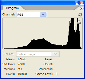
Not a very good shot, but let's assume that it is the only one we had and for some reason everyone had to see it. A lousy shot actually works well for my example. Here is the Histogram of this image:
A lousy picture of the picture. A very narrow range of the image.
The original file is actually 2736x3648 (10Mb) but I reduced it to 600x800 with bicubic downsampling so that it would fit well on this page. No other changes were made to the image.
Cropping Out clutter
The image is cropped to get rid of clutter that is not valuable or wanted in the picture. A picture tells a story, keep yours on topic.
For general use, 800x600 pixels or smaller is a good size to use. This keeps the file size down, allows the image to display well at 100% and will upload onto most websites well.
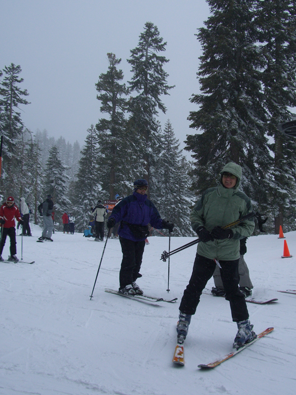
Knowing that, I crop the image with a bounding box that is at this scale. I cropped this image to 2159x2879. Essentially removing 38% of the picture that was doing nothing for us. I do not reduce or enlarge the image yet, just remove unwanted information and shape the image.
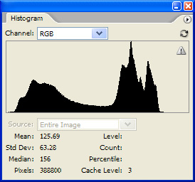
Here is a histogram of the cropped image:
Not much information at in the shadows and the highlights, and the gamma is way off.
Adjusting the Levels
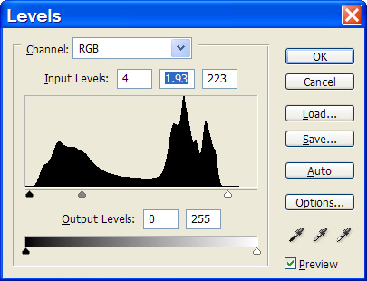
Now we adjust the levels. Our goal here is to make black black, white white, and grey, grey. Lots more can be done to an image to make it look it's best, but this is the biggest, quickest bang for the buck:
Here is the photoshop dialog box for levels adjustment.
This is how I ajusted the image:
And the subsequent image and histogram:
Notice how the image is clear now? The colors look right. You can see the details. White looks white, but not posterized. It seems like we are there.
Reducing the Size for Display
Now we finally reduce the image size. We are going to bicubically scale the image down to 600x800 pixels.
The image now looks like this:
And has a histogram like this:
[[
